

Just Do Something - What's in the Colors?
“What is the meaning of the different colors assigned to the Buy and Sell Signals?”

We got a comment this week asking some additional questions about the Buy and Sell Signals.
“What is the meaning of the different colors assigned to the Buy and Sell Signals?”
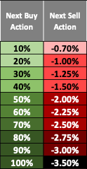
Great question and sorry we didn’t speak directly to this before. Most equity and ETF securities experience momentum moves. Each time a security reaches a Buy or Sell price, a signal is issued. We call it a “trigger”, and we number them. Sell trigger #1 is a security that is coming off a deep-down trend and has begun to move up in price. Sell trigger #2 is a Sell trigger price that is above Sell trigger #1, and so on. The more something moves in one direction, logic says, the higher the probability that there will be a correction. We don’t know when or how much, but we think you should “Just do Something”.
The coloring is just to let the subscriber know that the darker the color, the deeper the trend, and the higher the probability of a correction. Also, the percentages do the same thing. When you see a Buy signal that says 55%, what we are saying is the underlying security has experienced multiple Sell signals to the upside and we are suggesting that any allocation to the security should be something less than “all in”. The Buy signal is the reciprocal of the Sell signal. Sell Signal #1 says you are coming off a bottom therefore the Buy signal would be 100%. Sell signal #20 or -3.5% would have a Buy signal of 5%. In Late 2021 when everything was ripping to the upside, we were sending out Sell signals while the Buy percentages for most securities, if someone had to invest, were small. Based on the market peak in early 2020, that was a great call.
Enjoying DynaLogic? Please share with a friend!